Web design secrets – Audience who?
First 7 rules of start-up design – part 6
By Hadas Drachli
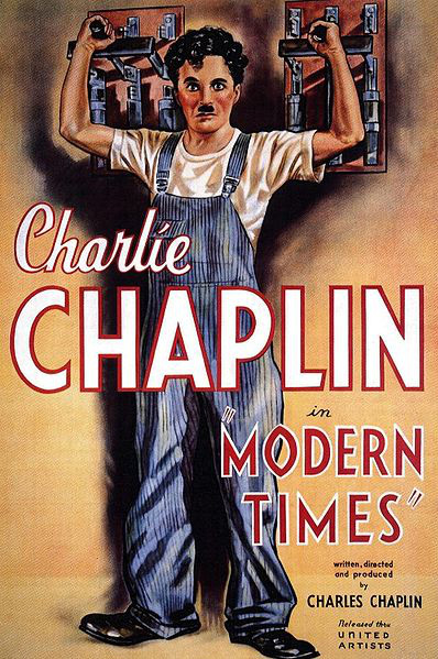
Charlie Chaplin’s last silent film, “Modern Times” (1936), hit the theaters at the peak of the great depression. Chaplin plays a hard working blue color industrial laborer in a factory where workers are oppressed, disregarded and not trusted.
The most famous scene from this movie depicts a constant movement of human hands, that are required to work as an automated machine and satisfy the superintendents and manager of the factory. This automatic motion continues as Chaplin prepares his supper. Chaplin expresses profound criticism over the exploitation of human beings who serve their masters in the modern world.
Luckily, in our global 21st century world, the trend of treating individuals as potential customers increases, and slowly breaks apart earlier patterns. Each individual can potentially be an opinion leader and a trend setter.
In the last few years we see the increasing influence and power of internet users on public opinion. This process actually changed the rules of the game for large corporations. Today, such companies invest huge resources in a new, yet crucial field – social responsibility.
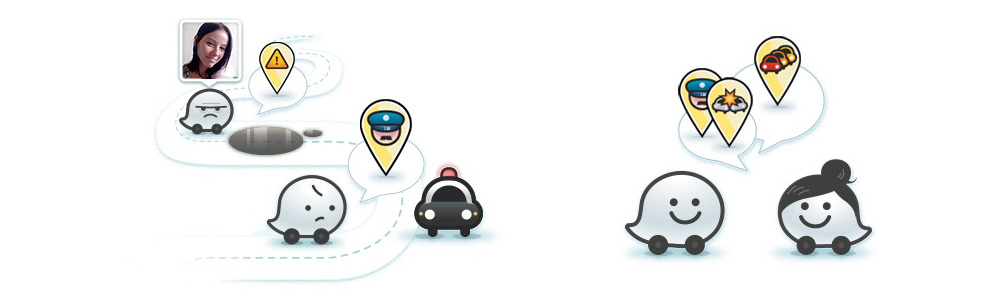
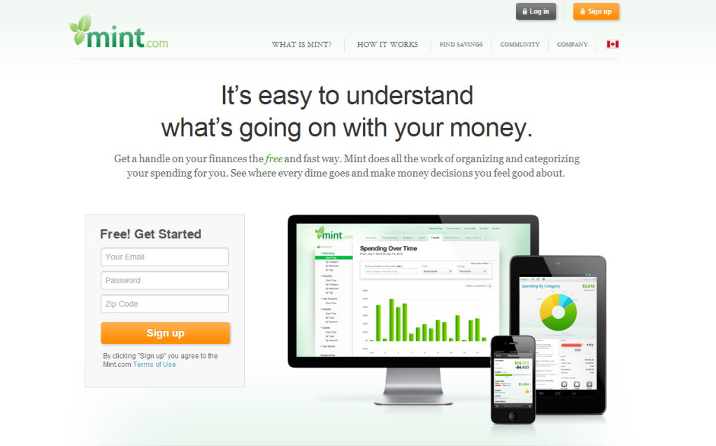
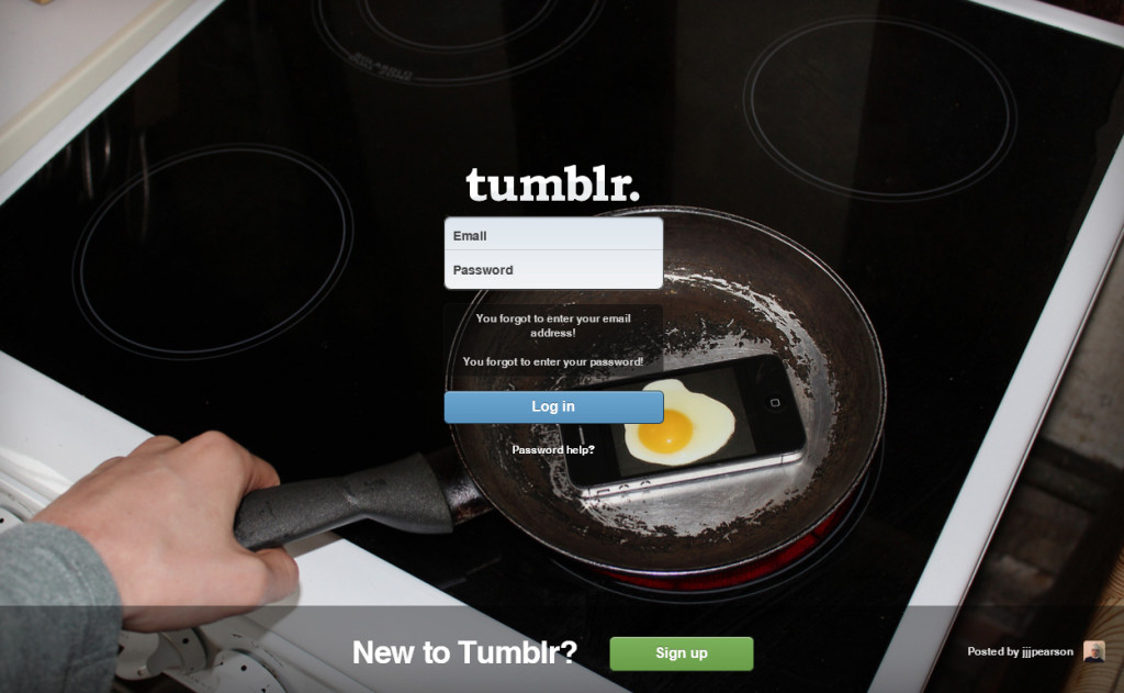
Walmart’s target audience can be easily defined – women, women, women. That’s why the company’s executives invest in female empowering, and try to fulfill their customers emotional needs.
Coca cola took an existing product and built recycling options around it – addressing their audience directly – from works of art through games to a fashion store:
In the process of building a brand and creating strategy, one of the most common questions you will encounter is whats your target market / audience. Usually, the research to identify this audience includes answering questions like “For who is it intended?” “Who is it relevant to?” “Where and how will they get it?” “What is the age range?” “Men, women or both?” The answers are milestones you have to cross before you get to the design process. We highly recommend to get to them earlier on, while still in the characterization process.
It’s fascinating to see how user influence research through various technological development (like Google analytics) show the variety of today’s audiences. There are still companies who produce for a specific niche target market, in fields like security, medicine or education, but most start up companies will address huge target markets with infinite varieties, and find themselves with several target audiences at any given time. This might be confusing especially since you need to differentiate the primary target market from the secondary.
For those of you who hold an idea you have not started to develop yet, a development that got stuck along the way, a design that does not supply leads, or that are right before stepping into a new enterprise – invest more time in mapping your future audience before moving forward.
A few pointers:
1. Questions. Elementary, yet still: the more you do your research, the more you find out. The first stage is the obvious questions. Later on you might get more benefits out of creating associative questions. This system helps to create an emotional picture of your audience and his daily habits.
For example:
Will the average potential customer use the product in the day, night, or without a time limit? While riding the bus or alone at home? Does he like to read a newspaper on Saturday morning? Is he vegetarian? Vegan? Prefers milk or soy milk? Will he visit the cinema or download a movie? What does he do on independence day? Christmas? Ramadan?
These might all sound ridiculous and not relevant, but they enable researching irrational emotional depths. The answers might give you a glimpse into your target audience’s subconscious, that can bring valuable insights to the design and UI development stages.
2. consider the environment you target audience is a part of with great care. Not just from a social-economical aspect, but from any relevant aspect. Understanding this environment will help you to better define the target audience and the ways to approach him and gain his attention.
3. Remember you are service providers. You do not take customers for granted and you should not take your target audience for granted. Even if you have a winning product on your hands. Even if there’s no competition, even if the product is essential to our survivor on plant earth. In any given moment there is someone else that treats the same audience with more kindness, even if just by a little. The 2013 audiences hold great value to support, at least as much as to usability.
4. The best way to get to know the target audience is to actually physically locate average potential customers, meet them, talk with them, live around them and feel them and with them. These actions demand a lot of resources and effort, but inter-personal relationships are not replaceable.
The deeper you go researching the character of your future target audience, the easier you make it for yourselves when you get to the design stage. The knowledge you accumulate will help the concepts and the imagination, will supply a sharp image of the audience, and allow the designer to design a precise, custom and personal digital experience for every customer.
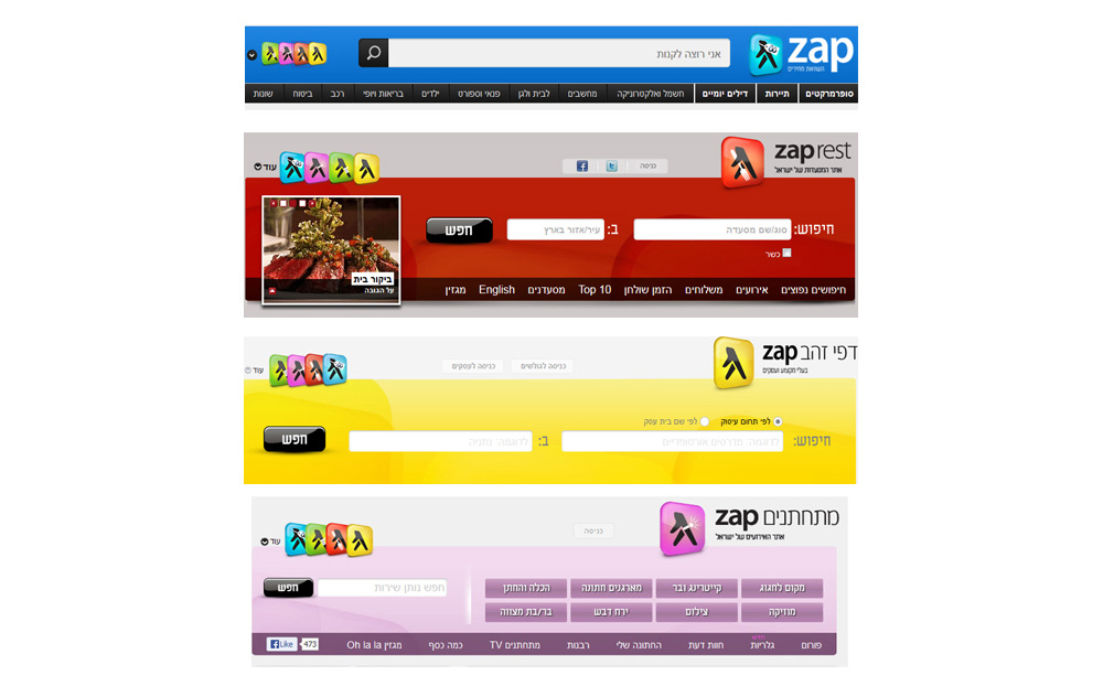
An example to such deep research can be seen on the re-branding of zap/yellow pages. If you have read the previous article – blue adults and red children – you will be able to identify using colors out of psychologically understanding the target audience – in practice.
To sum things up, personal and respectful approach toward our target audience, and deep research that enables knowing him on a personal and emotional basis, are irreplaceable. They will help you to visually present your product in an exact, easy to comprehend and understandable way – to the exact person you’re aiming at.
“All the world’s a stage, and all the men and women merely players” wrote Shakespeare. Today its not merely a stage, but an interactive one, where all the players influence and are influenced, watching and participating, active and activating. In a way, we’re all target audience for someone. It’s important to understand how much non-virtual value our opinions hold, as well as our perceptions and habits – especially in the internet age.
Blue adults & red children
First 7 rules of start-up design – part 5
By Hadas Drachli
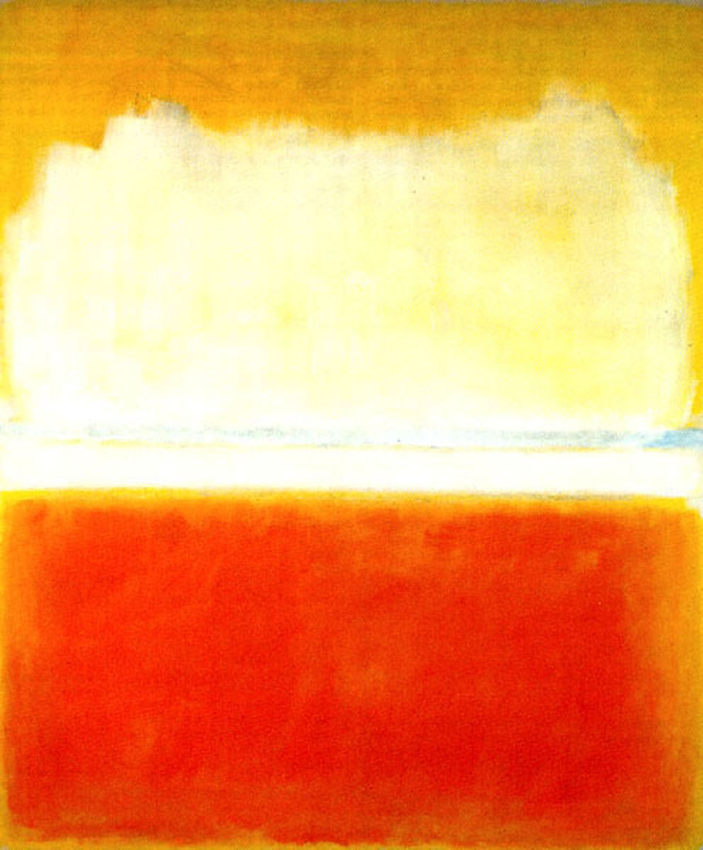
There are moments in life when you know you’ve fallen in love; it could be with another person, a book, a musical instrument or a hobby. At 16, the art teacher presented Mark Rothko – color fields artist – in the following way:
The paintings send a whole range of emotions through the viewer. Color use can move, excite, influence and change moods. The meaning of color and its effects on man has always fascinated artists, biologists, psychologists and various researchers. Today, after endless research, acknowledging the influence of color on our emotions is a consensus. We are affected by color at a biological level, and our color preferences change according to age, emotional state and the social environment we’re at.
Generally speaking, adults prefer the color blue, and then red, green and others. Children on the other hand prefer red, yellow, blue, and then the other colors (Terwogt and Hoeksma 1995)
Since colors affect our emotions, using different coloring will fill out different needs, and create the appropriate emotional effect. Its important to remember that color use has a bi-polar power – the “light side” and the “dark side”, if you will.
Using a specific color should be balanced and appropriate considering the other colors around, so no collisions are created. As you can see in Rothko’s paintings, color use can trigger the viewer’s happiness or sadness, calmness or impatience, softness or aggressiveness, fear and discomfort or calm serenity.
It’s not coincidental that police uniforms in the western world are colored blue, hospital uniforms green, and stop signs red.
The basic colors can be divided in accordance with their effect on our emotions: red, orange, yellow, green, blue and purple:
1. Survival instinct – food and sex
Red – identifying danger, food and procreation (sexuality), dynamic, immediate attention, desire, aggressiveness, stimulating, energetic, instinctive
2. Need of security
Blue – depth, safety, quiet, order, responsibility, peace, moral, authority, heavenly
3. Social need
Yellow – ambition, lightness, openness, cheerfulness, creativity, joy, interaction, childlike intensiveness
4. Health need and aiming toward balance
Green – nature, harmony, growth, health, clean, hope, development, well being
5. Need of the beyond, the supernatural, self fulfillment
Purple – intuition, imagination, art, dreams, longings, spiritualism
A little bit on black and white: white is a color that holds the entire spectrum of colors within. Black, on the other hand, is not technically a color but a lack of color. When casting white light on a white object, the object reflects all the colors back, therefore is seen as white. When casting white light on a black object, the object “swallows” all the colors and reflects nothing back, therefore is seen as black.
Black and white are the two ends of the same stick, and one cannot exist without the other.
White stands for knowledge, cleanness, purity, truth, simplicity, clarity, wholeness – the sum of all elements. Black stands for inner knowledge, mystery, drama, elegance, uncertainty, void, dedication. Grey is in between, and that makes it relevant when the needs are setting borders, mental thought, concentration, precision and coordination.
The total opposition of black and white is quite useful in the design world. For example, when testing a new logo, we’ll always test it in black and white first, to make sure the message is clear even with no color use. Only then we’ll get to the sharpened version of the message by using color and adding layers of meaning.
Color versatility is endless. How can you tell whats the right color/shade when it comes to a digital product? There are a few variables to take into account:
1. Every designer, like an artist, has their favorite color palette. There’s no good and bad here, only personal taste and fine tuning of your product’s identity. When you select the studio or designer that will accompany your start-up, you should check and see if you can relate to their color palette.
2. Style and trend – like in every field, the virtual world has trends, even when it comes to color. Sometimes (especially with products targeting large user communities) you need to check the current trend and adjust the product (the same way “whatsapp” icon was colored much like Apple’s SMS icon) – if the functionality association was already created, you might as well use it.
3. Product interoperability – is your product useful in the daytime or nighttime? Does it have physical accessories? Is it physically movable (a truck carring a shipment, for example, would be colored in a strong live shade to be seen from afar) or digital only? Answers to these questions will help matching the right color and shade with your product.
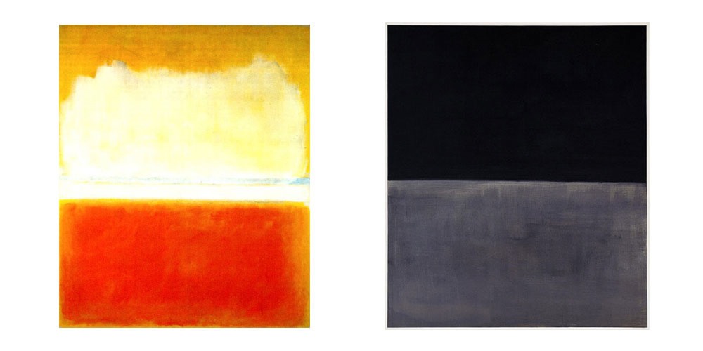
Rothko did not name his paintings. Instead he gave them numbers. He claimed the verbal connection interferes with the viewer’s ability to adopt the emotional and mystical emotional experience that color fields create. Thanks to his works we are more aware of the deep intensities of the color world, and we can use this knowledge in a balanced way to present our product clearly, and make it accessible for its audience.
A little game for a finale – Colorquiz researches the psychological meaning of colors, and allows a prognosis of mood according to the selected color. Good luck!
Secrets of design
First 7 rules for start-up design – part 4
By Hadas Drachli
Every designer will at some point come across the success story of FedEx. FedEx’s logo is considered to be one of the most successful logos ever created, in the design community and beyond it.
The magazine “Rolling Stone” claimed it is one of the best 8 logos to have ever been created in the US (in the 35th Anniversary “American Icon” issue).
So what’s the secret? Look closely:

The first symbols in history were pictographs. These are the first foundations to our written language. The first symbols imitated the shapes found in nature, using some of the most basic geometrical forms – a square, a circle and a triangle – to create complex forms. The symbol usage is intuitive: when the brain comes across an object it immediately approaches its “memory drawers” and looks for something similar in shape – this is a basic survival instinct action to assess danger. The actual meaning of the symbol is conveyed through its resemblance to an object we already know.
A few thousands of years passed, our DNA remains more or less the same, and these shapes are still extremely relevant to our visual perception and our ability to assess situations.
Today most of the companies in the world have a shape or an icon associated with its brand, alongside the literal name. The usage of both icon and text comes from the two hemispheres of our brain, and the different processing in each; the right side of the brain is in charge of the visual analysis: color, shape, form, sound, intuition and more; the left side is in charge of the literal, verbal and logical aspects, language functions, order etc`.
FedEx’s logo ingenuity is in the combination of the visual and literal dimensions, using negative space to pull it off. The “invisible” arrow between the words (archetype symbol of movement created by the basic triangle and square) is influencing our subconscious – that’s why we recognize the essence of the product in seconds.
The icon associated with Formula 1, the most prestigious car racing tournament in the world, gives us another example to this principle:

Like the FedEx logo, F1 combines shape and number, and uses negative space to achieve it. There are endless examples of icons hiding meaning in their negative space, using basic shapes – symbols for house, the world, star of David, snow flake and more.
In a more digital field, one of the most successful veterans gives us a demonstration of the psychology of branding:

This logo has everything: it is straight to the point serious on one hand, and warm and inviting on the other. We see the arrow immediately, and quite quickly we can also see the arrow is a smile too. Individuals looking for customer service will see the smile first; others who look for efficiency will first acknowledge the arrow.
The location of the graphic element is not coincidental. It’s a referral to the phrase “from a to z”. The meaning – we have everything – didn’t need to be literally stated since it was already conveyed visually.
Combining the visual and literal dimensions, with or without the negative space usage, grants life and meaning to the logo that in many cases cannot be otherwise conveyed, certainly not as quick or as effective. If you happen to be an entrepreneur, investor, owner, or hold any position in a company and wish to promote a brand – you probably acknowledge the importance of good branding. In the process of creating your brand logo, its highly recommended to address the target audience from the psychological aspect as well: is the brand targeting audiences with a tendency to be more right or left brain oriented? Should you emphasize the visual dimension or the literal one? What will convey the brand values in the best way? And if you wish to go one step further – can a way be found to use both dimensions to present the brand, and ensure an instant clear message?
User Experience, Design Process
First 7 rules for start-up design – part 3
By Shahar Naor
If creative fiction writing is a process of translating an abstraction into the concrete, there are three possible grades of such writing: translating an old (known) abstraction (theme or thesis) through the medium of old fiction means (that is, characters, events or situations used before for that same purpose, that same translation) — this is most of the popular trash; translating an old abstraction through new, original fiction means — this is most of the good literature; creating a new, original abstraction and translating it through new, original means. This, as far as I know, is only me — my kind of fiction writing.
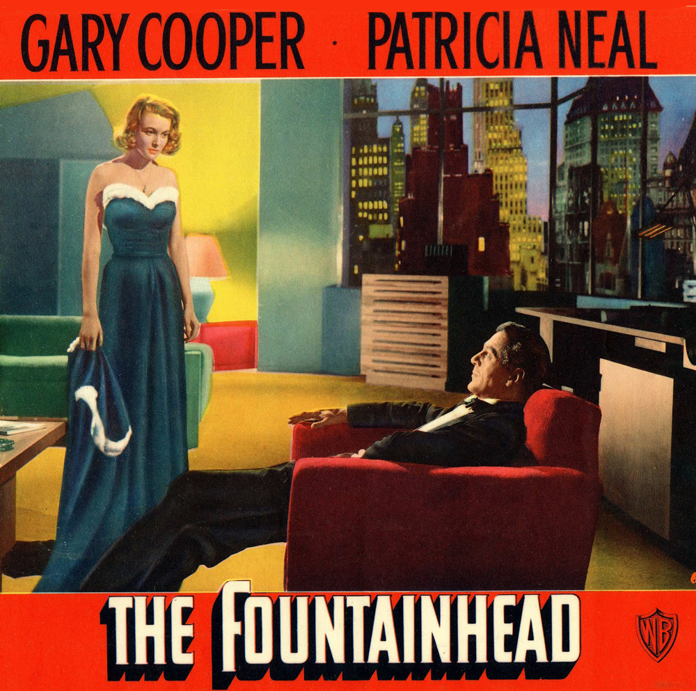
Ayn Rand
The American writer and philosopher, author of “Atlas Shrugged”, “We the Living” and “The Fountainhead”, chose to convey the philosophical system she called Objectivism through the image of the architect Howard Roark – an individualistic who chooses to struggle in obscurity rather than compromise his artistic and personal vision – promoting the freedom of the individual and independent thinking.
Every architect, from the average to the most independent and creative, start with a briefing of the job at hand. The designer’s job starts at the same point, and his involvement level, much like the architect’s, is established by the client.
After a complete list of demands, requests and goals, the architect will start collecting data: touring the construction site, checking existing plans and creating a work plan. For the designer, this is the characterization stage: specific and detailed definitions of the digital product, a complete and fully detailed site map, the modules in each screen, the connections between the different sections etc’ – parallel to the house structure, inside and out, electricity and draining systems, number of rooms and position of walls. An experienced client might create large portion of such a list on their own, but would also greatly benefit from using the professional – the designer – in order to create a detailed characterization document. Besides the clarity this document enables, it also helps coordinating the expectations of the client and designer, reaching realistic cost estimation, and allows the possibility of locating problems and challenges that might show up further down the process in advance – especially those that might set the client back a small fortune. Also, a detailed technical document gives a reference and control point to the entire process: the more complex a product is, the more people are involved in its creation, and the greater is the need to have common and clear language and goals.
Following the characterization, the architect will proceed to create the floor plan, or schematic design sketch. In the same way, the designer will continue to create a wire-frame. After receiving all the data regarding the target audience and the complete functionality of the digital product, the designer will begin a flowchart of the process that the end-user will follow – a schematic description, screen by screen, including all the parameters described in the characterization document. Each and every button and module of the digital product leads to a certain action, that will move us forward in the flowchart, until the end goal is reached.
When the architect approaches his physical task, he is helped by the contractor and various professionals in order to fulfill his client’s vision. In the digital world, the client has a development team. Unlike with a physical building, when creating a digital product the development team does not start by creating the final end parts of the product. Development starts by prototyping of each module described in the characterization document, that allows the creation of an interactively functioning wire-frame level product before creating the final finished product. This stage allows tests, updates and improvements for each of the possible actions of the digital product. In this important mid stage, the product is in limbo – it’s still in development, yet it’s already off the paper and allows interactivity. Here we can conduct preliminary usability tests and discover new solutions and paths.
The architect and the contractor finished creating the infrastructure, the building is standing, and the interior design stage commences. The digital parallel is designing the graphical user interface (GUI). The product will acquire its branding, its unique visuals and visibility. The graphical language will be consolidated, along with typography, icons, color schemes and playfulness – right along side with the development team’s final touches of functionality.
Once the GUI design is complete, the architectural comparison ends. The architect designs for a client that in most cases is also the end client. Even in the border cases when he’s not, like building a mall or an office building, after the completion of the physical design and built, there’s not much room for changes.
On the other hand, the designer aims for an infinite number of users from the beginning. The digital world is more forgiving, and allows us to complete the process by final usability tests, that examine both the final functionality and design. The result of these tests will let us make sure we didn’t miss anything along the road, and that the final product is simple and clear for every potential user.
After the completion of the final usability test we can launch a beta version of the product, and get feedback from a much larger audience for the final finishing touches.
A design process that is conducted using careful planing, original thought and professional execution is not a simple or short process, but the end results of a successful process such as that cannot be reached using shortcuts.
A house can have integrity, just like a person; and just as seldom – Howard Roark, Architect.
The Fountainhead, Ayn Rand
User Experience: The Buzz-word UX
First 7 rules for start-up design – part 2
By Hadas Drachli
Dr. Mark Weiser (52-99) lived a short life. He was a chief scientist at “Xerox PARC” research center, spent 8 years teaching computer science at the University of Maryland, was involved in numerous computer-related start-ups, and even found the time to be the drummer for the Palo Alto rock band “Severe Tire Damage”. His contribution to the technological world of our days is manifested mainly through papers he published in the 70s and 80s, which his followers described as “alternating perception” (among them a young Steve Jobs, unlike the older Jobs) – Weiser described a user experience and a user interface (today referred to as UX and UI).
Weiser’s articles described the human-computer interaction. He is the father and coiner of the phraseUbiquitous Computing, claiming the machine needs to be incorporated into the human life and adjust itself to it, and not to force people to adjust themselves to the technology.
Weiser called to develop ubiquitous computing by what he called “Calm Technology”, and established some ground rules:
– The purpose of a computer is to help you do something else
– The best computer is a quiet, invisible servant
– The more you can do by intuition the smarter you are; the computer should extend your unconscious
– Technology should create calm – and be informative yet non-intrusive
These principles are the cornerstones of characterization or design of the user experience. If we use them wisely earlier along the road, while still developing the idea of the digital product, they will guide us into the best path for our product, and increase the chance of future success.
Unlike any other time in history, nowadays information and data are practically endless. We have multiple choice out of a never ending variety of possibilities, huge databases on any possible subject, enormous assortment of similar generic products, and in every field: two decades ago Israel had one TV channel, today there are hundreds; there are thousands and thousands of brands of food, clothing, medications, and any other product imaginable.
The internet, on which we’ve become accustomed to rely upon in the last two decades, was a central cause in this consciousnesses and accessibility to this variety, which we now take for granted. Therefore, covering the user experience aspect is crucial to the successful marketing of our product. The digital designers, an integral part of the team that develops the product, are in charge of designing the experience.
The main purpose of the user experience is to explain, guide, lead and showcase the product and its capabilities to the user in a supportive, friendly, intuitive and most important non-intrusive way. The daily virtual two-dimensional reality deals mainly in air-time and information-satiated users. The real challenge is to maximize the experience using all of the user’s senses, without burdening him/her.
So how do we convey a pleasant emotional experience through pixels?
Like in every field, there are a few approaches to the matter. Yet the parameters themselves remain the same:
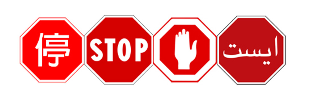
Visibility – Creating visual elements using colors, typography, shapes and symbols to convey a message to the user. Color, shape and symbol hold a huge amount of information in them, and affect our subconscious. For example: picture a stop sign – It’s red, showing an open hand. The visibility will stay the same in every country you might visit (with minor changes). Moreover – if you approach a friend, or even an animal, with the same gesture of an open hand, you’ll find the effect is identical to the one the stop sign is holding (more on design secret and tricks in the next articles).
Order – Intuitively and accessibly arranging the elements in space, in a way that’s easy to understand and that keeps the elements connected to each other. Our brain likes to organize and rearrange all the time. We keep pulling information from our “drawers” of short and long term memory with every new situation.
Organizing the elements in a familiar and easily processed way for our brain, will create a pleasant introduction between the user and the new interface before him.
Usability – The clarity and ease of use with which the product communicates with the user. The goal of the computer is to help you do something else. The design is supposed to convey not only the visual experience, but also the guidance. It should point out the right path to take, or click, in order to reach the final goal.
Psychological Research – At the end of the day, emotions lead us to various actions. While designing a digital product’s graphical user interface, it’s important we know and connect to our users cognitively. For that matter, an accurate slogan/strap-line could make all the difference.
Gamification – The most elaborate product will be understood if its conveyed in way that creates an experience, and there’s nothing like a game to feel an experience. When designing a site, application or any other GUI, a playful aspect should be taken into consideration, one that takes us from one screen to the next with sophisticated (yet easy to comprehend) challenges that are tailored to the target audience. Keeping the user curious will be rewarded with more clicks, until the final goal is reached.
In conclusion:
A will to make things easier for the user, planning ahead keeping the user in mind, with the cooperation of the entire development team and an aesthetic, practical, emotional and playful design – will create a good product and a financial success.
Dr. Mark Weiser died at 46, less than 6 weeks after he was diagnosed with cancer. He planned to write a book that might have predicted even more than he already had, and he left us with a precise, unique and ahead-of-its-time perspective, that today is considered a standard in the interaction of man and computers.
How to choose the right designer for your startup
First 7 rules for start-up design
By Hadas Drachli
It’s almost impossible to ignore design nowadays. More and more companies ascribe as much importance to the design as to the product itself. This concept is even more apparent in the start-up world – a virtual product, a never before seen idea, new modules and algorithms, special applications code, smart search engines – the start-up products are new ideas to the audience and might be challenging for the non-technological audience. A poor design will manage to confuse even the greatest technophiles.
So how do we find the right person to design a software or hardware idea?
A successful design takes the vision of the engineer, programer, entrepreneur or investor, and presents it to the user in the most friendly and clear to understand way possible, that will also be impeccably aesthetic.
So, what is design?
Design includes numerous fields. Simplified, it can be described as an action that has the potential solve any visual difficulty in the virtual of physical world.
Each product has an idea behind it, a story holding an experience. A successful design works in collaboration with this story, promotes it, highlights it, supports it and creates reliability. The design is the story – visually.
In the physical world, the experience is three dimensional. You can touch the product and feel it. When purchasing a refrigerator or a washing machine, the external aesthetic is clear, the main function is familiar, and the sub-functions will be explained through the accompanying booklet. We usually also know the reputation of the brand. All this data creates the image of the product for us.
In the start-up world, the experience is virtual. All the details, starting from function to reliability, are transferred via the digital design and the interactive user experience. The product itself might be composed of thousands of details and functions. The design is the visual mirror image of the product, and it includes all the visual elements of the story behind it – the logo and slogan, website, application, fonts and typography, color scheme, icons, buttons, various modules and the arrangement of everything on the screen – they all come together to create the interactive image for the user.
Here are a few hardly-earned-through-experience principles that might help you find the right designer for your digital product and maximize the benefits from working together:
1 – Digital Thinking – A digital designer for a start-up company’s product needs to think interactively. Got a recommendation? Go to the designer’s website and check it out. Can you find your way easily? Is the design style clear and fits your needs? Some designers master one style, while other adopt a few. Be that as it may, each project should be unique. Mastering one style isn’t necessarily a disadvantage, but if all the projects seem to be of the same mold, its probably not the design you’re looking for. After the initial examination, stop and check yourselves – what was your experience during this time? Do you feel like you’d like to keep on looking at stuff? Did it move you to act (click)? How are the various elements presented on screen? Too crowded/spacious? A mess or in harmony?
2 – A digital designer for a start-up company needs technical knowledge – it’s no secret that designers and programmers think differently. It’s recommended to choose a designer with some basic ability to read/write code and not just create visuals – even if this knowledge sums up to simple css & html capabilities. In order to plan a successful graphical user interface (GUI) the designer needs to understand what can be accomplished and how, and the greater this understanding is – the more friendly and clear to the user will the final product be. In the start-up world, with its rigid deadlines and launch dates, with regularly updated software versions, a designer that can collaborate with the development team and speak in the same language will save you time and money, and will make the difference between a successful product launched on time and a not so successful product that’s also delayed.
3 – Understanding processes and seeing the big picture – A designer for a start-up company need to know how to see and position things in space. A physical product design doesn’t have to be in context or collaborate with its specific environment. It can, of course, but it can also act as a standalone product. When we’re dealing with digital product design (much like broadcast design for TV) – the product is always a part of its digital environment. Designing an interface for a website or an application demands spatial perception to position the elements on frame, and for the continuity of the actions through every screen. Each stage/page/screen needs to guide and lead the user toward the end action.
4 – Listening – A digital designer for a start-up company needs to be able to listen to the entrepreneur or idea-person, understand the idea through and through, ask questions, and never take anything for granted. Today marketeers are certainly not the only ones to acknowledge the importance of design – the entrepreneurs wish to take active part in the design process, and rightly so. A digital product is an idea that needs elaborate breakdown and conceptualization, and it’s crucial to find a designer that will listen and understand the idea, and not waste precious time. In the exact same way, you should listen as well. A designer can bring new insights, to the point of changing the core idea. A digital designer brings years of interactive experience. Of course you don’t need to blindly accept every idea, but there’s a good chance you can make good use of some of them.
5 – Patience – You, the inventors, already have and idea you’ve processed and turned endlessly. You’ve disassembled and reconstructed it and its clear to you from beginning to the end. You’ve managed to raise funds and recruit the development team, and you took a short breath of air. When you reach the actual development and design, the impatience is at its highest, and its easy to give up and cut corners. A good designer will do their best to meet your schedules, but always remember that a successful deign demands a lot of planning ahead. The designer is not the entrepreneur, investor or developer, but they are the person that transforms your idea from the realm of imagination into the digital reality. Its important to be patient and tolerant, and if you’re not sure your idea was completely transferred – repeat, be even more precise, on each step, again and again: what are the products capabilities and function, who’s the target audience, how do you see your product, and any other detail that is important to you. Its the last chance you get to run over the logic behind the product before it takes its digital form. Use it.
6 – Freedom to act – Choose a designer you trust completely, and that’s not relevant to start-ups alone. You did the research, you meticulously chose a designer that meets your every demand – trust them, and trust your own choice. A good designer that is given more freedom to act and suggest will gladly accept the professional responsibility, will be more invested in the product and supply you with more new creative ideas you didn’t see before. At the end of the day, if you give a designer more freedom to do their thing, they’ll see themselves as an integral part of the project. Highly recommended.
7 – Complexity vs Simplicity – No matter how complex the product is and how sophisticated the target market is, a digital design’s main strength is its simplicity. A successful design will transfer a complex idea in a way that will be simple even to the least technological person you could imagine. A good designer will take this complexity and convert it into a series of simple and easy to understand actions. Unlike the finality of a physical product, a digital product is constantly updated. Because of that, the simplicity should be internal as much as external. Not just the interactions with the user, but the inner logic of the actions. Integrating a designer in the development planning stage, together with the rest of the development team, can give you priceless added value – logic simplicity. If your product is constructed by a simple set of actions and clear logic, it will be much easier and quicker to add, change and update characteristics in the future, that are bound to happen.
8 – Trendiness – Any product, digital or not, is contemporary. The digital world holds trends just like any other field, and a good designer will always stay up to date with the recent trends, as well as be familiar with the previous ones, and will be able to recommend the right design style for your product’s story and the business model you chose.
9 – Cost – The million dollar question (or slightly less). Like every premium service – a successful designer will probably charge a higher price. The price incorporates the eight previously stated principles, but despite the fact that experience and professional level might save a lot of time and money in the long run – a high starting price could be deterring – and is not always justified.
How can you know if the price estimation you received isn’t too high? The range is as wide as the number of designers, and it’s very hard to tell the difference beforehand. So after going through the previous eight principles and receiving a price estimation, see what it includes. Is the designer the kind that finishes one project and jumps to the next? Or is he/she willing to stay and escort the project the whole nine yards? What are the rates they suggest for work outside the defined project? What’s the level of commitment and involvement they are willing to take upon themselves, and what will be the cost? Check how many projects do they operate simultaneously. It’s worthwhile and important to have involvement, presence and commitment to your project, and on a long term.
The stage your start-up is at can take an important role here; If you’re just at the beginning and under budget restrictions, your needs could be satisfied by a new designer with less experience and lower rates. If you’re further ahead, it might be financially beneficial to stretch your budget and hire a more experienced designer. Also, you can always try to find an experienced designer that will believe in the product and will be willing to work under lower rates for future options.
Final note
A connection with a successful, experienced professional designer, that can keep up with your deadlines and is easy and fun to work with, and fits your budget – is possible. True, it’s not a Catholic wedding, but its not that far either. As far as a digital product goes, the design stage is never over after the first launch, and you should invest efforts and resources to locate such a designer, that will save you a lot of time, money and headaches along the road.