First 7 rules of start-up design – part 5
By Hadas Drachli
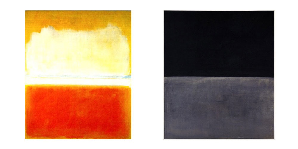
There are moments in life when you know you’ve fallen in love; it could be with another person, a book, a musical instrument or a hobby. At 16, the art teacher presented Mark Rothko – color fields artist – in the following way:
The paintings send a whole range of emotions through the viewer. Color use can move, excite, influence and change moods. The meaning of color and its effects on man has always fascinated artists, biologists, psychologists and various researchers. Today, after endless research, acknowledging the influence of color on our emotions is a consensus. We are affected by color at a biological level, and our color preferences change according to age, emotional state and the social environment we’re at.
Generally speaking, adults prefer the color blue, and then red, green and others. Children on the other hand prefer red, yellow, blue, and then the other colors (Terwogt and Hoeksma 1995)
Since colors affect our emotions, using different coloring will fill out different needs, and create the appropriate emotional effect. Its important to remember that color use has a bi-polar power – the “light side” and the “dark side”, if you will.
Using a specific color should be balanced and appropriate considering the other colors around, so no collisions are created. As you can see in Rothko’s paintings, color use can trigger the viewer’s happiness or sadness, calmness or impatience, softness or aggressiveness, fear and discomfort or calm serenity.
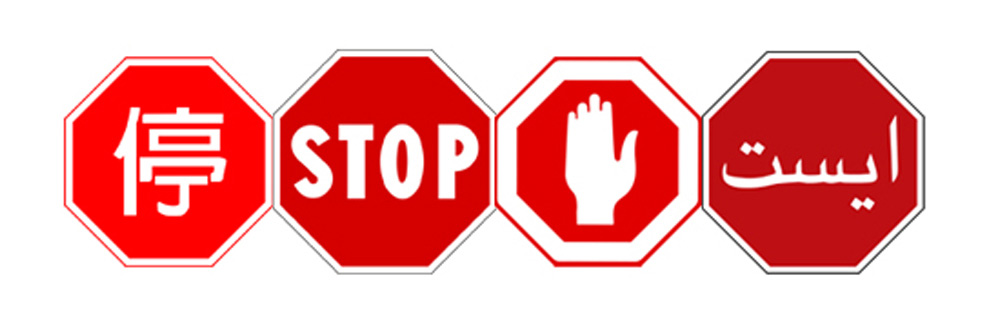
It’s not coincidental that police uniforms in the western world are colored blue, hospital uniforms green, and stop signs red.
The basic colors can be divided in accordance with their effect on our emotions: red, orange, yellow, green, blue and purple:
1. Survival instinct – food and sex
Red – identifying danger, food and procreation (sexuality), dynamic, immediate attention, desire, aggressiveness, stimulating, energetic, instinctive
2. Need of security
Blue – depth, safety, quiet, order, responsibility, peace, moral, authority, heavenly
3. Social need
Yellow – ambition, lightness, openness, cheerfulness, creativity, joy, interaction, childlike intensiveness
4. Health need and aiming toward balance
Green – nature, harmony, growth, health, clean, hope, development, well being
5. Need of the beyond, the supernatural, self fulfillment
Purple – intuition, imagination, art, dreams, longings, spiritualism
A little bit on black and white: white is a color that holds the entire spectrum of colors within. Black, on the other hand, is not technically a color but a lack of color. When casting white light on a white object, the object reflects all the colors back, therefore is seen as white. When casting white light on a black object, the object “swallows” all the colors and reflects nothing back, therefore is seen as black.
Black and white are the two ends of the same stick, and one cannot exist without the other.
White stands for knowledge, cleanness, purity, truth, simplicity, clarity, wholeness – the sum of all elements. Black stands for inner knowledge, mystery, drama, elegance, uncertainty, void, dedication. Grey is in between, and that makes it relevant when the needs are setting borders, mental thought, concentration, precision and coordination.
The total opposition of black and white is quite useful in the design world. For example, when testing a new logo, we’ll always test it in black and white first, to make sure the message is clear even with no color use. Only then we’ll get to the sharpened version of the message by using color and adding layers of meaning.
Color versatility is endless. How can you tell whats the right color/shade when it comes to a digital product? There are a few variables to take into account:
1. Every designer, like an artist, has their favorite color palette. There’s no good and bad here, only personal taste and fine tuning of your product’s identity. When you select the studio or designer that will accompany your start-up, you should check and see if you can relate to their color palette.
2. Style and trend – like in every field, the virtual world has trends, even when it comes to color. Sometimes (especially with products targeting large user communities) you need to check the current trend and adjust the product (the same way “whatsapp” icon was colored much like Apple’s SMS icon) – if the functionality association was already created, you might as well use it.
3. Product interoperability – is your product useful in the daytime or nighttime? Does it have physical accessories? Is it physically movable (a truck carring a shipment, for example, would be colored in a strong live shade to be seen from afar) or digital only? Answers to these questions will help matching the right color and shade with your product.
Rothko did not name his paintings. Instead he gave them numbers. He claimed the verbal connection interferes with the viewer’s ability to adopt the emotional and mystical emotional experience that color fields create. Thanks to his works we are more aware of the deep intensities of the color world, and we can use this knowledge in a balanced way to present our product clearly, and make it accessible for its audience.
A little game for a finale – Colorquiz researches the psychological meaning of colors, and allows a prognosis of mood according to the selected color. Good luck!